Responsibilities: Research| UX | UI
How to make brokers and landlords stop using the inefficiency and subjectivity of traditional office layout planning methods?
background
Real estate layout planning
An office layout plan is a visual representation of the layout and design of an office space, including the placement of furniture, walls, doors, and additional features. The goal of an office layout plan is to create a functional and efficient work environment that promotes productivity and comfort for employees.
the problem
Time-consuming
Creating an office layout plan can be a time-consuming and expensive process. The amount of time and money required will depend on various factors such as the size of the office space, the complexity of the design, and the tools and resources available.
Our tech solution
AI-powered tools and algorithms that analyze data on factors such as foot traffic patterns, employee preferences, and ergonomic considerations to generate optimized office layouts.
market research
Addressing competitors from end to end
The market research began with a thorough competitors analysis where I categorized products by three parameters:
1. Direct competitors
2. Similar competitors
3. Products that compete with us over the same need
2. Similar competitors
3. Products that compete with us over the same need
the challenge
Identifying benchmarks with limited resources
One of the greatest challenges of this project is not having the access to competitors’ products in order to actually test them.
I overcame that by using different tools for product comparison, as well as reading customers’ reviews of our direct competitors.
user study
Talking to them
To understand the pain points I interviewed different brokers and landlords and I understood how our tool can help them
- Difficulty in renting or leasing office spaces
- Maximizing the use of space
- Meeting tenant expectations
- Planning for future growth
- Compliance with regulations
- Difficulty in renting or leasing office spaces
- Maximizing the use of space
- Meeting tenant expectations
- Planning for future growth
- Compliance with regulations
solution
Navigation wizard
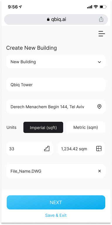
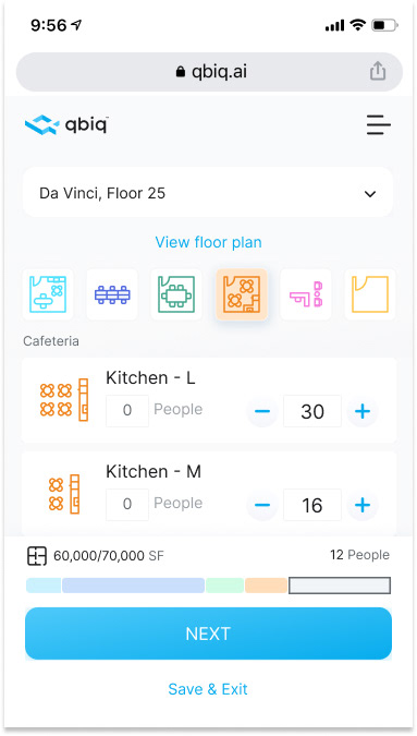
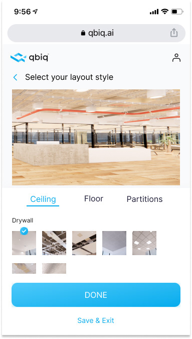
We devised a navigation wizard to aid users in providing information critical to their project layout. However, our initial approach was problematic, as the vast amount of information requested left users feeling perplexed and uncertain of what was expected of them.
To rectify this, we revised the process by dividing it into smaller, more manageable steps, allowing users to leave and come back at a later time. With a clearer request for information, progress tracking, and skip options, we saw a marked improvement in completion rates and the quality of the data collected.
To further enhance the user experience, we reworded our error messages to be more user-friendly and enlightening. These changes resulted in a simplified and effortless navigation process, allowing users to easily provide the necessary information with confidence.
user testing
Testing the final concept with users
To validate our solution, we conducted user testing with the prototype of our navigation wizard. Participants were selected based on their alignment with the target user persona and their willingness to provide feedback. During the testing, we observed users as they completed various tasks and gathered qualitative insights through follow-up interviews.
We also asked participants to rate their overall experience and individual tasks, providing us with valuable data to further refine and improve the design. Through this user-centered approach, we were able to validate that our solution effectively addressed the pain points identified through our initial user interviews, resulting in a streamlined and user-friendly navigation experience.
the designs
Sleek, scalable, intuitive
In the design process, I put a strong emphasis on delivering a seamless user experience that caters to a wide range of users. My approach was centered on creating a user-centered design that prioritized accessibility and inclusive design.
To achieve this, I incorporated several key UX principles such as usability, simplicity, and intuitive navigation. I ensured that the interface elements, such as buttons and font sizes, were easily accessible to users with a low technological orientation by adopting larger sizes and familiar design patterns. This improved the overall usability and user-friendliness of the product.
Additionally, I made sure to provide clear and concise tutorials and instructions to guide users through their journey. This reduced the frustration and confusion that often arise when using new products.
