Captain Credit is a new free credit score and finance tracking app available in Israel. The app reflects the user’s financial status and helps him gradually improve it in order to achieve optimal economic conduct.
My Role
UX Research
Workshops
Concept
UX Design
Microcopy
UI Design (Desktop Platform)
Workshops
Concept
UX Design
Microcopy
UI Design (Desktop Platform)
Goals
The goal was to design an accessible and easy-to-use interface, making complex information and processes intuitive, convenient, and coherent.
The challenge
The credit rating field is foreign to the Israeli public and can be perceived as complex and threatening, but it is not a choice - as of April 2019, every Israeli citizen over the age of 18 has a credit rating that takes into consideration his financial conduct. My mission was to introduce credit score to the Israeli public in a friendly and easy way.
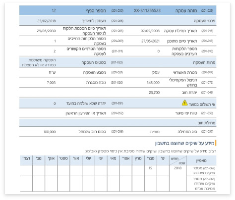
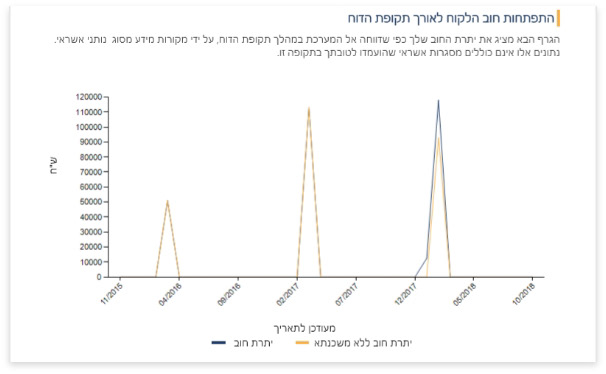
Research
After setting a goal and defining the expected challenges, I began my comprehensive research.
This included:
- Audience and motivations research
- Interviews with potential users
- Direct and indirect global competition analysis
- Global trends research
This included:
- Audience and motivations research
- Interviews with potential users
- Direct and indirect global competition analysis
- Global trends research
One of the first questions I asked as we kicked this project off, was how often is one’s credit score updated. The answers I got were inconsistent and varied from two months to once a year. I quickly realized that this territory is brand new even for the clients, and they are still unsure regarding the mechanics. I then concluded that our app has to do a lot more than just present the score.
Ideation
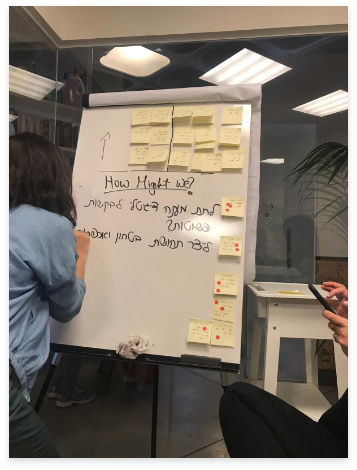
While the client had a clear vision of the main functionality of the app - presenting credit score, they were unsure regarding which additional functionality the app should support. Naturally, we decided to meet and have a brainstorming workshop. We got lots of optional features and ideas, which we then browsed through and considered along with the client, and sorted the final results according to sustainability and compatibility.
Concept
Creating a personalized feed that encourages users to delve into and explore a new financial aspect by integrating into the user's daily life, through personalized offers and tips. An innovative interface that presents recommendations and educational-financial tools, adds value by combining content and tools that will serve as an incentive for signing into the app beyond expected usage.
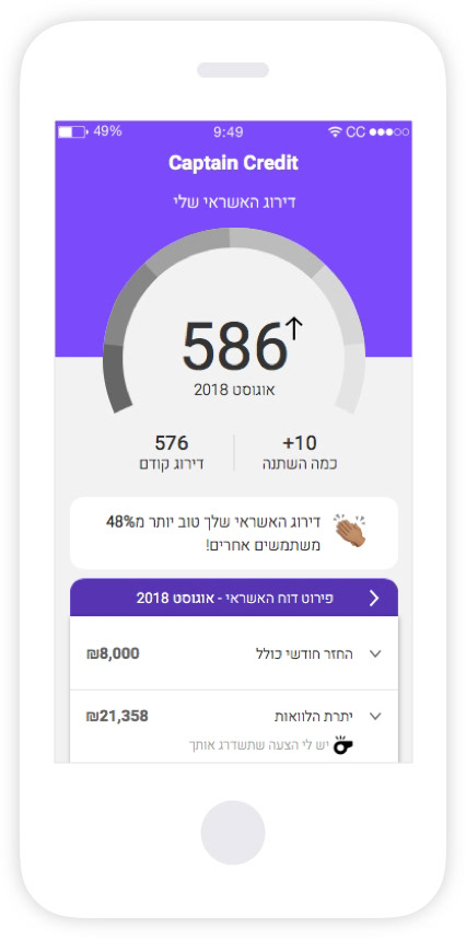
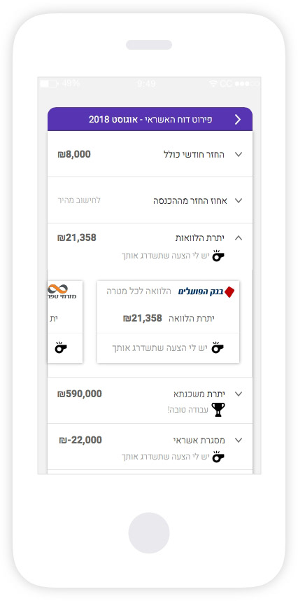
Wireframes
Homepage
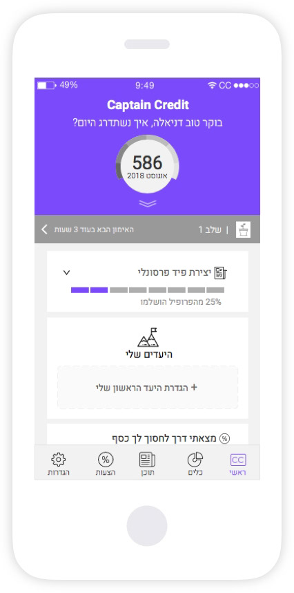
The homepage is divided into 2 states which are determined by credit score updates. When the score is updated the score component will expand and take the entire screen. The user can explore further the effect of the score and their options regarding it. In the second state which is also the default, the credit score is collapsed allowing the feed to offer relevant content and tools that suit the user's score.
The homepage is divided into 2 states which are determined by credit score updates. When the score is updated the score component will expand and take the entire screen. The user can explore further the effect of the score and their options regarding it. In the second state which is also the default, the credit score is collapsed allowing the feed to offer relevant content and tools that suit the user's score.
Personal Training
I designed a gamification area for a daily personalized trainer where the user gets a short article each day according to his credit score status. At the end of each article, the user is provided with questions related to the article, answering the questions the user receives a score and gradually levels up through the training. The goal is to teach and educate the user about ways to improve their credit score and accordingly, to offer them more economically affordable offers (such as loans/mortgages/credit cards).
I designed a gamification area for a daily personalized trainer where the user gets a short article each day according to his credit score status. At the end of each article, the user is provided with questions related to the article, answering the questions the user receives a score and gradually levels up through the training. The goal is to teach and educate the user about ways to improve their credit score and accordingly, to offer them more economically affordable offers (such as loans/mortgages/credit cards).
Goals
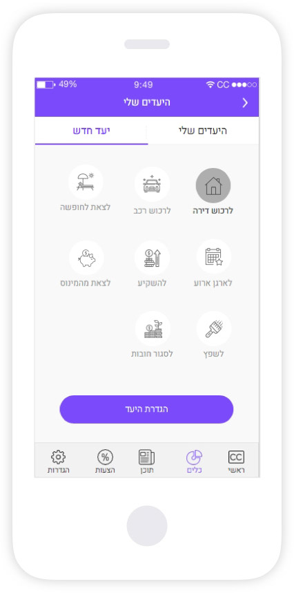
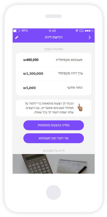
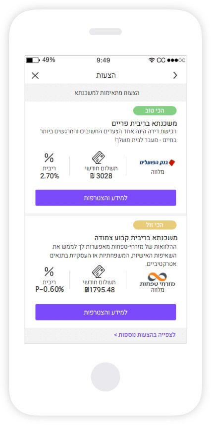
Most people lack the time and dedication it takes to groom their finances and improve their spending habits to reach their savings goals. This UX flow allows users to customize their savings goals, for example -buying an apartment. The creation of a new goal is guided step by step when at the end of the process the user receives recommendations, insights, and tips for achieving their goal. I added an “edit”, and “delete” buttons on each goal box to make these features more easily accessible to the user.
Most people lack the time and dedication it takes to groom their finances and improve their spending habits to reach their savings goals. This UX flow allows users to customize their savings goals, for example -buying an apartment. The creation of a new goal is guided step by step when at the end of the process the user receives recommendations, insights, and tips for achieving their goal. I added an “edit”, and “delete” buttons on each goal box to make these features more easily accessible to the user.
Desktop
Designing the desktop interface, I took into account the addition of real estate. A good example of this would be while designing the mobile I placed the credit score in 2 states to save space but on the desktop, I could take advantage of the added space. I used actions like hover to reveal the credit report details and gave more space for the content area where users can easily delve. After the UX process, I went to design the desktop screens according to the style guide created for the mobile version.
Designing the desktop interface, I took into account the addition of real estate. A good example of this would be while designing the mobile I placed the credit score in 2 states to save space but on the desktop, I could take advantage of the added space. I used actions like hover to reveal the credit report details and gave more space for the content area where users can easily delve. After the UX process, I went to design the desktop screens according to the style guide created for the mobile version.
Working on this project was exciting and interesting due to its magnitude and ability to affect such a large audience. Due to the client’s tight schedule and deadlines, we had to skip things like usability testing and QA.
I think there's still much more to do with the app (interfacing with the user's bank account for example). Still, working on this app has given me a stronger skill set and workflow. I learned a lot about teamwork and communication through a cross-functional team of designers, developers, product managers, and executives.
