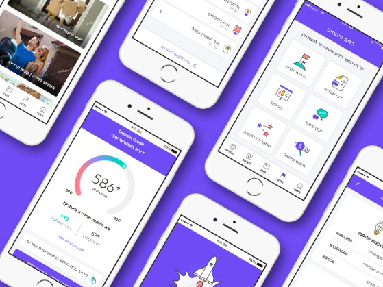
iintoo is a social investment network, specializing in quality real estate investments. Our collaboration with iintoo consisted of two levels: designing the digital platform interacting with the customers and designing the management system that will be used by the employees.
My Role
UX Research
UX Design
UX Design
When I started working with iintoo, they explained a lot about their technology and the complicated calculations their system does, but when I examined their teams’ actual work, I was amazed to discover an outdated, slow and clumsy back-office system that leads employees to make mistakes instead of helping them. It does not match the spirit of the company at all.
At first glance, it seems that the effect of an outdated back-office system is not terrible but this drastically affects the speed and quality of work and the service the end customer receives. This is reinforced when it comes to a modern digital company that is outwardly innovative.
Goals
Design accessible, easy-to-use interfaces, making complex information coherent and the processes intuitive and convenient.
Challenges
The main challenge was finding a solution that would take into account all the pain points of the employees, including needs and daily tasks – and eventually, make their work easier, more efficient, and meaningful.
But how do I enter all the information displayed on the desktop while maintaining correct hierarchies also on mobile? The usage scenario between the mobile and the desktop is different. It was necessary to understand when and why the users open the mobile platform and design it accordingly.
Research
I researched their current solution and its flaws. I examined the main value of the product and its benefits and researched them from a user perspective. The first step was to play around with the system, their main data table wasn't intuitive, it had broken lines and unclear function buttons.
It was interesting to see that the stakeholders know the product well and they do not notice its complexity, as far as they are concerned - all that is missing is to make the product look beautiful.
After presenting them with my quick and dirty prototype they quickly changed their mind and realized the current complexity and poor functionality of their system. By creating low-fi layout concepts, I could easily visualize the product architecture and how people will interact with it.
The system has many user profiles, ranging from field agents using mobile to analysts with desktop. Therefore, user research has been very meaningful in the process of creating personalities and it was important to understand the routines of each. Creating the personas allowed me to look at employee use cases. However, the final solution had to be equally usable for everyone.
Wireframes
The information in the tables was useless without the ability to act intuitively according to the data. A good data table is one that allows users to scan, analyze, compare, filter, sort, and manipulate information to gain insights and take action.
What was my part in this?
• Fixing the row header as a user scrolls provides context on what column the user is on.
• Set the table to scroll only in the first fold of the page thus preventing a long scroll of the entire page.
• Provide users with control over column width optimizing the view of abbreviated data.
• When hovering over a row, an action menu appears on the side providing additional actions, which greatly reduced the visual load. (I have taken into account that users are highly experienced, and their natural interaction will lead them to discover the option easily.)
• In the existing system, clicking on a row led to a pop-up with various actions that lead to situations of pop-up within a pop-up, often leading to scenarios where users have to navigate non-intuitively at. I decided to turn the information contained within the pop-up into table extensions – allowing the user to still obtain the extra information without losing their context.
• User's search through the system was mainly used with either a general word or by multiple fields, I chose to split the filter action into a general search across all fields and an advanced search that opens all filters and allows users to search for specific values in each column.
• The pagination had a string with a display of the number of results, but they had a lot of pages, so what happens if the user wanted to jump to page 40? It was a pain to constantly go through 40 pages to get to it so I created a "displaying page" input. I also included a “Rows per page" dropdown so the user could customize what they wanted to view.
What about mobile users?
On a mobile screen, real estate is limited, and users’ attention is short-spanned. The first thing was to understand what are the needs of mobile users versus desktop. Seeing that the main functionality is to view data and not add data, I decided to approach this with a few changes moving from desktop to mobile:
• Once the user locates the desired row and taps it, a new page will open allowing one to view all column values on a separate page. This list-detail relationship and established mobile design pattern, fit very well.
• Transformed the data by collapsing the table rows into separate cards which are more optimized to view a vast amount of data.
• Some of the less common actions moved into the menu and are no longer displayed on the screen.
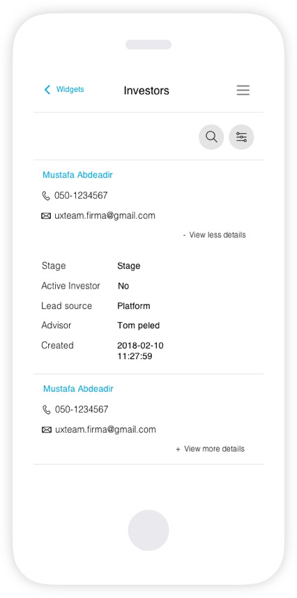
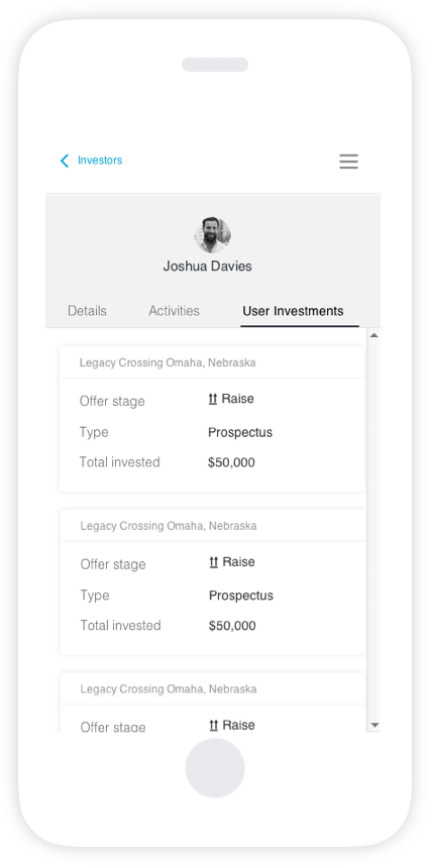
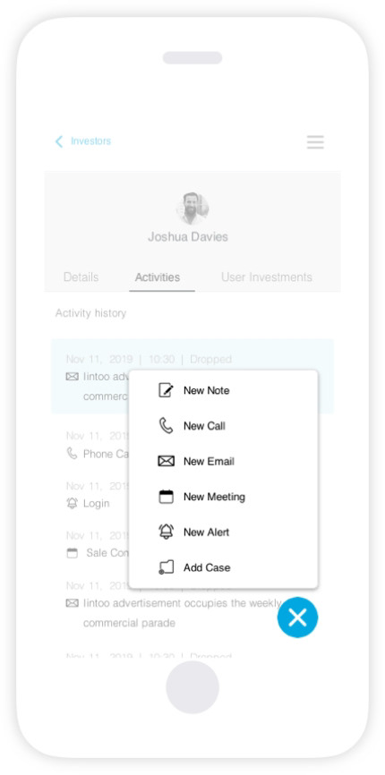
By focusing on discrete steps of how information is consumed, I was able to limit the presented content to its most relevant essence. This was a game changer in the project as the client realized that users don’t have to view a large data set all at once, while still not losing any relevant information.
